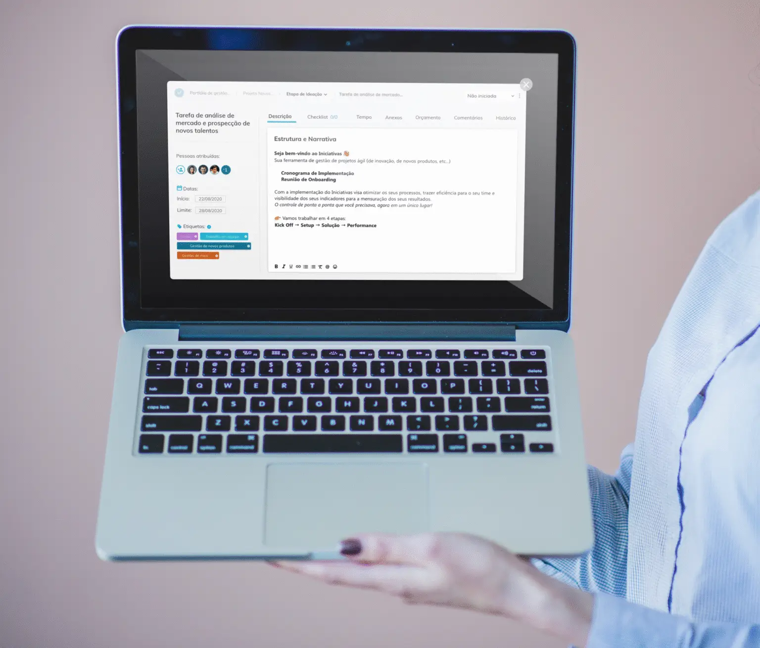
Task Modal Redesign
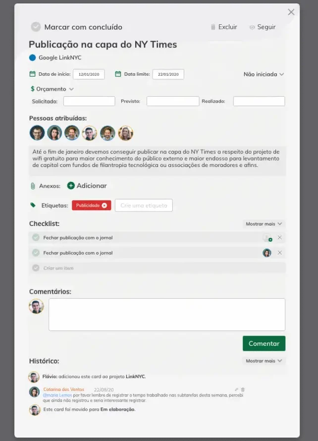
During my time at a technology company specializing in innovation project management, I participated in the redesign of the task modal — one of the platform’s most critical components.
The challenge was to improve usability while preparing the interface to support new features in a scalable way. This project was particularly meaningful, as it marked the company’s first usability testing initiative. It brought valuable insights, strengthened the user-centered design culture, and established this practice as a strategic differentiator within the organization.
Problem
In the previous version of the task modal, several issues hindered the user experience:
-
A vertical layout that required excessive scrolling for long descriptions.
-
History and comments displayed together, making it hard to follow updates.
-
The addition of new features would make the interface even more cluttered.
Objective
The goal of the redesign was to create a clearer, more organized, and flexible interface that would make users’ daily work easier and prepare the platform for future enhancements.
Technologies and Role
In this project, I worked end-to-end — from the initial analysis to the delivery of the validated prototype.
My responsibilities included: research, ideation, wireframing, prototyping, conducting usability tests, and iterating based on feedback.
Tools used:
-
Figma → wireframes, prototyping, and documentation.
-
Word and Excel → usability test scripts and results compilation.
Design Process
Immersion
Analysis of existing issues and exploration of design references.
Ideation
Generation of hypotheses and solution proposals.
Prototyping
Creation of low-fidelity wireframes and interactive versions.
Usability Testing
Validation with 10 internal users, including managers and task executors.
Iteration
Refinements based on collected feedback.
Wireframes and Alternative Exploration
After the ideation phase, I developed low-fidelity wireframes in Figma, creating navigable versions of the modal to quickly and efficiently test ideas before implementation.
The wireframes focused on:
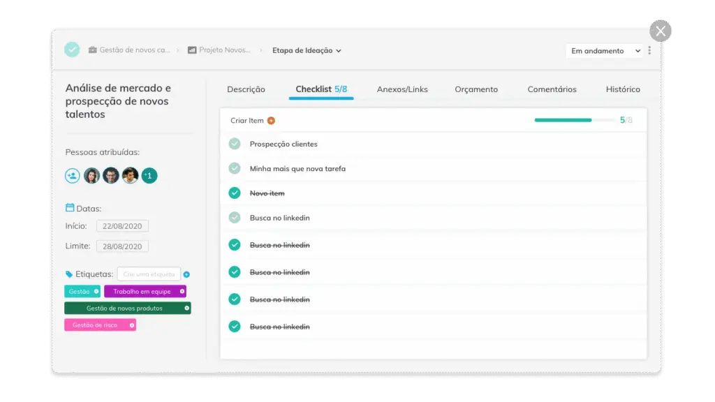
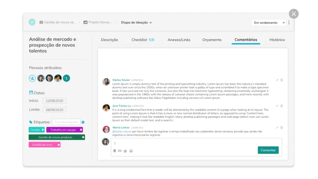
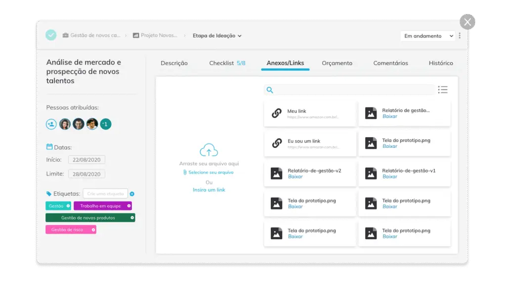
- A tabbed layout to reduce scrolling and organize history, comments, and attachments.
- Basic interactive components for navigating between tasks.
- A fixed top section with key task information always visible.

Once the wireframes were ready, I conducted a design critique with designers from other teams to align on the best approach. From there, I created a high-fidelity interactive prototype and led usability tests with 10 internal participants — a mix of managers (task creators) and executors (task doers).
This approach allowed us to validate assumptions, identify friction points, and gather quick, actionable feedback. The insights guided the next iterations, refining the interface before its final release.
Challenges
A major challenge in this project was that the company had never conducted usability tests before.
There were concerns that involving clients might raise unwanted expectations or delay deliveries.
To address this, I proposed conducting internal tests with employees who were also daily users of the platform. This approach made it possible to validate solutions quickly and safely, within deadlines and without risk to client relationships.
This initiative paved the way for usability testing to become a recognized and valued practice within the organization.
Final Solution
The final version of the task modal delivered significant improvements:
-
Key information fixed at the top, always visible.
-
Tabbed content organization, reducing scrolling.
-
Lateral arrows to navigate between tasks without closing the modal.
-
New component for inserting links in the attachments tab.
-
Visual adjustments for better clarity and navigation between sections.

